
Climate Charts and Data Without Comment
A collection of charts and data points on carbon dioxide, climate change, its impact on humans and the environment, and, finally, climate economics.

Introduction
In this post which I update from time to time, I have collated some interesting charts and data points concerning our climate. This data is easy to find if you are interested, but it rarely appears in the mainstream media. Everything I present comes from official sources, many from the US and UK governments and research bodies, including peer reviewed scientific papers.
The point of this collection is to stimulate questions, such as:
Q. How does this data fit in with the mainstream media presentation of climate change issues?
and
Q. How effective is global spending on climate change?
I hope this may be useful as a resource to share with people who are concerned about the climate, and possibly to the extent of feeling there is an “emergency”. Whenever I speak to anyone of this view the answer is always:
I just don’t have time to do the research to check whether you are right so I’ll have to rely on what the BBC/Guardian/CNN is telling me.
Hopefully, this data resource will provide a useful starting point to help people see the wood for the trees, without having to do their own detailed research.
Please add your thoughts in the comments including suggestions for other charts and data that could be included. If do you have suggestions, please provide links to original sources.
I have tried to credit as many people and organisations as possible that originally alerted me to the specific charts and data. If I have missed anyone, please let me know and I’ll be happy to add.
Carbon Dioxide
Variation of carbon dioxide level over time

Source: https://gml.noaa.gov/ccgg/trends/
Carbon dioxide and temperature changes over thousands of years
The following chart is based on the Vostok Ice Core data which shows the variation in temperature and carbon dioxide over 50,000 years, beginning 150,000 years ago. The dark blue line is the temperature and the orange is CO₂ concentration.
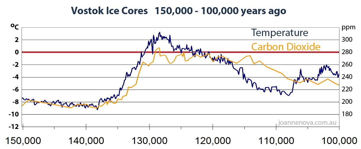
Source: https://joannenova.com.au/global-warming-2/ice-core-graph/
The physics of radiative heat transfer
The equation describing radiative heat transfer due to carbon dioxide is as follows:
where:
𝚫T = change in temperature
S = climate sensitivity
C = new CO₂ concentration
Co = reference concentration
This is a logarithmic relationship which is why climate scientists talk about the impact of CO₂. The rise is dependent on S the climate sensitivity to changes in CO₂ concentration. Assuming a value for S of 3°C per doubling gives rise to the following chart.
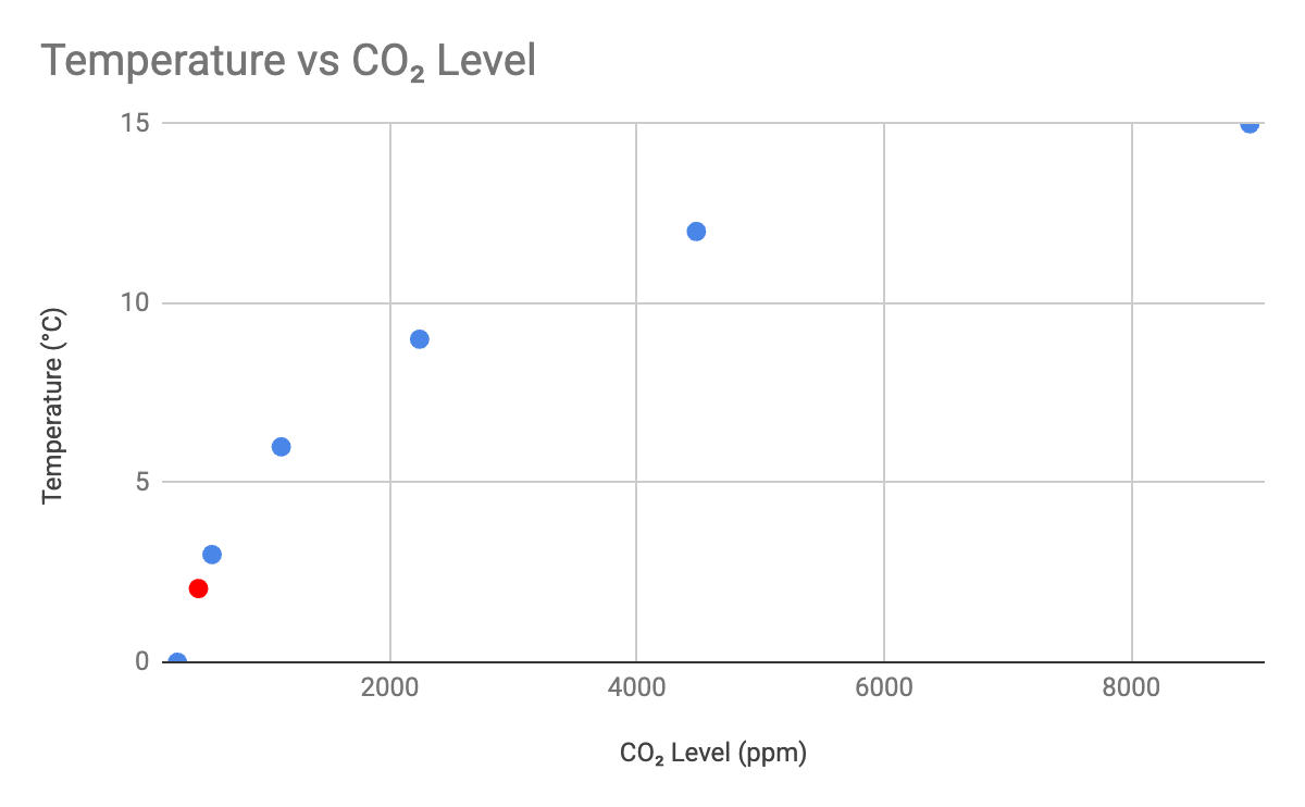
The x-axis begins with a zero temperature rise corresponding to the pre-industrial CO₂ concentration of 280 ppm. The blue dots represent the doubling values of CO₂ concentration and the red dot shows where we are today at about 450 ppm.
Source: G. Myhre et al., Halfway to doubling of CO₂ radiative forcing, Nature, 2017, https://www.nature.com/articles/ngeo3036
Atmospheric carbon dioxide levels over geological timescales
Figure 25 in the paper ‘Arkansas and Climate Change’ by the CO2 Coalition shows historical carbon dioxide concentrations:

Sources:
Berner, RA, Kothavala, Z, 2001a: GEOCARB III: A Revised Model of Atmospheric CO2 Over Phanerozoic Time. American Journal of Science 301, 182–204. https://doi.org/10.2475/ajs.301.2.182
Berner, RA, Kothavala, Z, 2001b: NOAA/WDS Paleoclimatology – GEOCARB III: A Revised Model of Atmospheric CO2 Over Phanerozoic Time. IGBP PAGES/World Data Center for Paleoclimatology, Data Contribution Series # 2002-051, NOAA/NGDC Paleoclimatology Program, Boulder, CO, USA. https://www.ncei.noaa.gov/access/metadata/landing-page/bin/iso?id=noaa-forcing-5778
Impact of different carbon dioxide levels on life on earth
< ~50–100 ppm: Photosynthesis stops entirely. Plants cannot produce enough carbohydrates to sustain growth, leading to starvation. Respiration (CO₂ release) outpaces fixation, causing rapid tissue breakdown and eventual death within days to weeks, depending on reserves.
100–150 ppm: Minimal or zero net photosynthesis; plants shift to respiration-only mode, depleting energy stores. Growth halts, leaves yellow (chlorosis), and vulnerability to pests/diseases increases. Crop yields can drop dramatically (e.g., 50–100% reduction).
< 200 ppm: Prolonged low CO₂ (as in glacial periods) stunts overall plant evolution and diversity, reducing biomass and altering ecosystems. Modern plants evolved under ~300–400 ppm baseline; dips below 150 ppm could end terrestrial plant life as we know it by halting the carbon cycle.
> 5,000 ppm: OSHA Permissible Exposure Limits (PEL) for 8-hour time-weighted average, aligned with NIOSH recommendations.
> 40,000 ppm: NIOSH Immediately Dangerous to Life or Health (IDLH) value, based on acute inhalation toxicity studies in humans.
UK emissions as a proportion of global emissions
UK emissions = 0.7% of global total
Sources:
Estimated total UK net territorial emissions for 2024 = 371 MtCO2e. https://assets.publishing.service.gov.uk/media/67e4060df356a2dc0e39b4cd/2024-provisional-greenhouse-gas-emissions-statistics-statistical-release.pdf
Estimate global emissions for 2024 = 53206.4 MtCO2e. https://edgar.jrc.ec.europa.eu/report_2025
Climate change
Global mean surface temperature
A comparison of historical global temperature anomalies (from NetZero Watch) compared to average diurnal temperature variations across continents.

Source: Berkeley Earth, https://berkeleyearth.org/
Sea level rise since 1992

Source: https://www.star.nesdis.noaa.gov/socd/lsa/SeaLevelRise/LSA_SLR_timeseries_global.php
Rising sea levels and the Maldive Islands 1969-2019
53% of islands gained land area
25% eroded
22% remained stable
In summary, 75% of the islands gained land area or remained stable
Post-glacial sea level rise
The following chart shows sea level rise since the end of the last glacial episode based on data from Fleming et al. 1998, Fleming 2000, and Milne et al. 2005. These papers collected data from various reports and adjusted them for subsequent vertical geologic motions, primarily those associated with post-glacial continental and hydro-isostatic rebound.

Source: https://commons.wikimedia.org/wiki/File:Post-Glacial_Sea_Level.png
Polar ice measurements

Source: Paul Homewood, 25 Sep 2025

Source: Paul Homewood, 7th May 2025
United States annual heat wave index
Figure 7 in the paper ‘Arkansas and Climate Change’ by the CO2 Coalition shows how the contiguous US annual heat wave index has varied since 1890:

Source: United States Environmental Protection Agency 2025a: Climate Change Indicators: Heat Waves
Drought
From NetZero Watch.

Source: Hao et al. 2014
Hurricanes (ACE)
ACE is accumulated cyclone energy, a measure of the total energy expended by hurricanes each season. From NetZero Watch.

Source:
Precipitation
From NetZero Watch.

Source: Koutsoyiannis 2020
Snow Cover
From NetZero Watch.

Source: Koutsoyiannis 2020
Impact on humans and the environment
Population growth, births and deaths
The following chart shows a combination of two charts from Our World in Data:
‘Population by World Region’ shows historical population growth with projected growth for the main continents based on the UN Medium scenario. The data sources are given as HYDE (2023), Gapminder (2022) and UN WPP (2024). Historical country data is shown based on today’s geographical borders.
‘Births and deaths’ are overlaid and gives the historical and future projections for births and deaths world-wide. The source is given as UN, World Population Prospects (2024).

Source: https://ourworldindata.org/population-growth
Annual number of deaths from natural disasters

Source: https://ourworldindata.org/natural-disasters
Flooding and deaths from flooding 2000 to 2024
From the paper ‘Quantifying the climate crisis: a data-driven framework using response indicators for evidence-based adaptation policies’ by Gianluca Alimonti and Luigi Mariani, the following chart displays 25 years of flood related data. In this case the chart shows the estimated annual inundated area (Joshi et al., 2024) and number of flood disaster events (EMDAT, 1988) left axis; deaths from flooding (EMDAT, 1988) right axis.
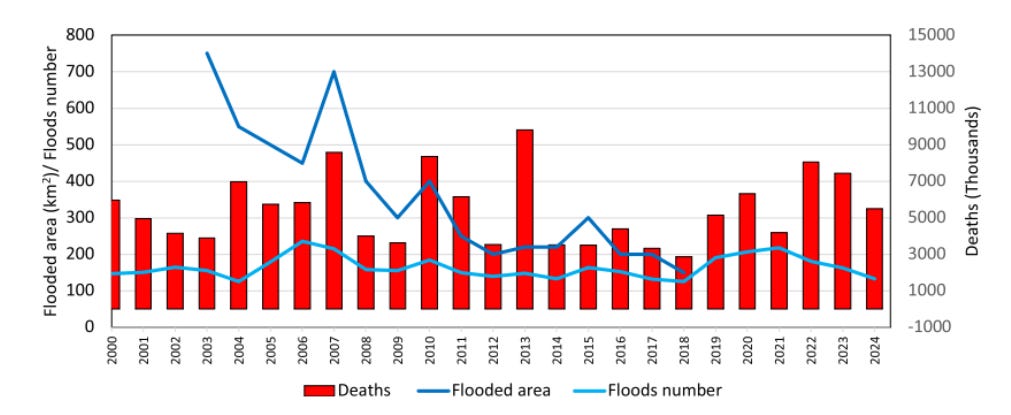
Source: https://www.tandfonline.com/doi/full/10.1080/17477891.2025.2571708
Worldwide grain production
This chart is from the CO2 Coalition and shows the variation of grain production with CO2 level:

Source:
https://co2coalition.org/facts/more-co2-helps-to-feed-more-people-worldwide-2/
CO2: Boden TA, Marland G, Andres RJ (2016) Global CO2 emissions from Fossil-Fuel Burning Cement Manufacture and Gas Flaring 1751-2013. CDIAC,
Temp: HadCRUT4 (2017) The Hadley Climate Research Unit (HadCRUT4) annual global mean surface temperature dataset
Polar bear population changes
The following chart is from the report “The state of the polar bear 2021” by Susan Crockford:

Source: https://thegwpf.org/content/uploads/2022/02/StateofPolarBears-2021.pdf
The Great Barrier Reef
The following chart is a composite of coral cover data in three major Great Barrier reef regions, as measured by the AIMS Long Term Monitoring Program.

Source: State of the Great Barrier Reef 2024, Peter Ridd
Climate economics
Global climate finance 2011-22

Therefore, the 10-year spend is approximately 3.6 trillion dollars.
Source: https://www.climatepolicyinitiative.org/publication/global-landscape-of-climate-finance-2023/
Future climate finance required
For comparison with the previous chart, the future annual finance required is approximately 10 trillion dollars per annum on average:

Source: https://www.climatepolicyinitiative.org/publication/global-landscape-of-climate-finance-2023/
Global energy substitution

Source: https://ourworldindata.org/grapher/global-energy-substitution
UK Electricity Generation Costs
Figure 2 of the UK government report ‘Electricity Generation Costs 2023’ presents the Levelised Cost of Energy (LCOE) for gas power (CCGT) compared to offshore wind, onshore wind and large-scale solar for projects commissioning in 2025 (in 2021 prices). In case you haven’t come across LCOE before you can find out more about it in my article Why the Renewables Industry Loves LCOE.

Natural gas commodity prices in Europe and the United States
The following chart, from Statistica, shows prices from 1980 to 2024, with a forecast for 2025 and 2026 (in U.S. dollars per million British thermal units):

Source: https://www.statista.com/statistics/252791/natural-gas-prices/
Gross Domestic Product (GDP) per capita vs energy use

Source: https://ourworldindata.org/grapher/energy-use-per-capita-vs-gdp-per-capita